![]()
This logo is not for sale.
Similar logos are available in the pre-designed-medical category:
Medical Location Logo
Image file: medical-location-logo.gif
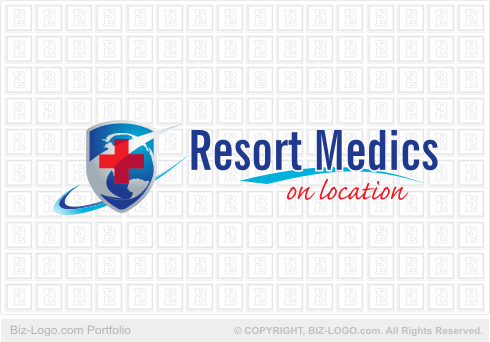
Our client is from Fort McMurray, Canada.
The pre-designed logo displayed here is the graphic design product from the studios of Biz-Logo.com.
The Medical Location Logo features five main components. They are the cross, a medical icon, the globe showing the Americas, a shield, two swooshes and the company name and its strap line.
The cross design is symmetric. The cross is colored red. The globe designed underneath the cross is designed to fit in perfectly within the parameters of the shield. The shield carries one of the two swooshes. The second swoosh is designed in concave format running behind the shield. Both the two swooshes give way to the design of the company name and its strap line. The inner swoosh is designed in convex format and having a transparent appearance to it, sweeps over the upper portion of the red cross. The outer swoosh has a thin membrane designed to the inside of the concave format, complimenting the deep blue color of the two oceans of the globe.
The names of the colors are: red - Fill: 100% PANTONE 187 C (lower portion of the cross); red - Fill: 100% PANTONE 185 C; blue - Fill: Fountain, Outline: None; greys - Fill: Fountain, Outline: None.
The font used to design the text is called NewsGothic BdXCn BT (66.908 pt). The strap line is designed using the font Caflish Script Pro Regular (42.13 pt).
The name and strap line of the company is designed to the right side of the logo.
A third swoosh designed in convex format separates the name and strap line.
There are no border lines or a drop shadow.
More Case Studies
More from pre-designed-medical
Pre-Designed Logos
Custom Logos
![]()
Hand-crafting logos, since 1997
"Do you provide phenomenal service or what!!
Thank you so much..."
![]()
More Testimonials

Homepage Ready-Made Logos Logo Search Custom Logos FAQ Site Map Contact
Part of ![]() Graphics Factory
Graphics Factory
![]()