The reason for the popularity of abstract logos is quite simply that they are extremely effective. Imagine a business where the product range might expand in future. Ninety nine percent of businesses qualify. Now imagine the company wants a logo that shows what they sell. The logo would have to be updated every time the product range expands, undoing all the brand recognition that the company has built up. With an abstract logo the door is left open. The business can change direction completely and keep their logo.
In our pre-designed logos section we have divided our abstract logos into three sections:
circular abstract logos (which includes globes, planets etc.)
As you page through the designs on those pages you'll notice that our definition of "abstract" rests more on possible uses than on the appearance of the design. Technically a lighthouse logo, for example, is not an abstract logo. Traditionally the word abstract is equated to non-figurative, but in it's application the lighthouse becomes "abstract" in the sense that it can be used effectively to represent anything from a shipping company to a search engine.
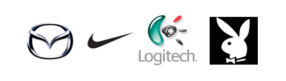
Some of the more famous abstract logos include Mazda, Nike, Logitech and Playboy.
And here are some recent abstract logos from the Biz-Logo logo design portfolio.
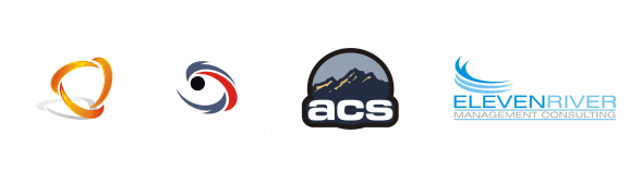
In the traditional sense neither the Playboy logo nor the ACS logo would qualify as "abstract", but these are great examples of logos where the application puts them in the abstract logos category.
The drawbacks of abstract logos.
There are some pitfalls in abstract logo design that you should take note of before selecting an abstract logo for your company. Most notably: The over-simplified logo. Simplicity is a virtue in logo design, no doubt about that, but less experienced designers often lack the skill to take a simple shape and turn it into a unique simple shape. Having a red dot as your logo might be the ultimate in "bold, minimalist logo design", but chances are that your red dot logo isn't the only one out there! As a general rule we recommend to our customers that they register their logos as trademarks as soon as possible. That's the only way to ensure that your logo is unique to your company.
Another potential problem is the dreaded semi-abstract logo. "Is it supposed to be a flower?" When you get that question a couple of times a week you'll be changing your logo before your company celebrates its first birthday. Guaranteed.
Abstract logos should ideally be completely abstract. If something recognizable is drawn or implied in the drawing, then it should be recognizable enough that the intent is clear. When you work with Biz-Logo we'll send you batches of concept designs. It's always a good idea to show them around. You know that that shape is supposed to be a palm tree (because that's what you specified when you ordered your custom logo), but if a significant proportion of your friends and family think it's a green spider, then it's no good to you. Good thing then that Biz-Logo offers unlimited revisions :-)
More Abstract Logos
@ Biz-Logo
Check out the abstract logos in our pre-designed logos section. (The first 4 categories)
You will also find a gazillion abstract logo designs among our logo examples. If there is a specific type of logo that you would like to see more examples of before you place your order, please get in touch. We have literally thousands of logos in our archive. We'll send you some. Use the big red "Contact Us" button at the bottom if this page.
![]()
Hand-crafting logos, since 1997
"Do you provide phenomenal service or what!!
Thank you so much..."
![]()
More Testimonials

Homepage Ready-Made Logos Logo Search Custom Logos FAQ Site Map Contact
Part of ![]() Graphics Factory
Graphics Factory
![]()